Anúncios
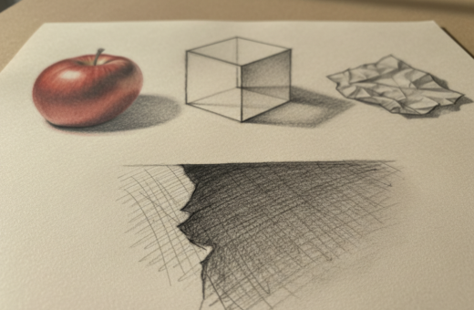
Mastering how light hits a form is a fast way to make your paintings feel real. Dan Scott of Draw Paint Academy uses an egg to show the steps. His method helps a beginner see how shadow and highlight define shape.
This short guide shows how to watch the way light falls on an object. You will learn to place a clear line between light and dark and to use your brush with intent.
Understanding the science behind light is steady and measurable. That makes it a reliable tool for any artist who wants stronger form, depth, and believable work.
Follow this simple painting guide and practice with a single egg. Small studies like this build the visual skills every art student and working painter needs.
– Use simple subjects (an egg) to study shadow and highlight.
– Practice making a clear line between illuminated and shaded areas.
– Apply brushwork to convey three-dimensional form.
Anúncios
Understanding Light Direction Drawing Basics
Begin by locating the single dominant source that shapes the tonal map of your subject. This makes it simple to see where the brightest highlights and deepest shadows will fall.
Defining the Light Source
Identify the main light source before you sketch. Note its position and strength. That source dictates cast shadows and the soft gradations on the form.
The Importance of Observation
Spend time watching how the source changes with the time of day and with small shifts in your subject.
Anúncios
- Use a reference photo to freeze a moment and study shadow edges.
- Practice tracing the line between highlight and shadow on simple objects.
- Record how subtle moves of the source alter mid-tones and contrast.
This guide trains your eye to read value relationships. A clear grasp of the light source is the first step to creating believable drawings of any subject.
The Science of Light and Shadow
Understanding how light sculpts form gives any artist a repeatable method to build believable results. Figure 1 shows how a simple circle becomes a convincing planet by adding a full range of values.
The science of light and shadow is what lets you create the illusion of three-dimensional reality on a flat surface. By mapping the brightest spot, mid-tones, and darkest shadow, you define the object’s shape.
Practice turning values into shading by working across a small study. When you can place many different values, you learn to suggest depth in every painting and sketch.
- Train your eye: notice subtle shifts where highlights fade into shadow.
- Apply the range: use strong darks and soft mid-tones to model form.
- Repeatable process: this is a measurable approach that helps your art and future work.
Learning this science removes guesswork. It gives every artist a solid foundation to improve drawing, shading, and overall painting skill.
Identifying Your Primary Light Source
Start by finding the main beam that sculpts your subject on the page. This tells you where to place highlights, mid-tones, and the deepest shadow. Use simple observation first, then confirm with a reference.
Determining Light Intensity
Notice how the light source affects shadow edges and contrast. In Figure 2 you can practice locating where the cast shadow falls around a sculpture. That cast shadow is the clearest result of the source position.
Watch the object and mark where tones shift. A strong source makes crisp shadows. A weak source softens edges and blends mid-tones.
- Identify the primary light source to map all values on your subject accurately.
- Observe where shadows fall on the object to discover the source and its direction.
- Use a reference to practice judging intensity and shadow sharpness.
Every object reacts differently to a source. Learning that relationship is vital for believable form and a successful final result.
Mastering Highlights and Mid-tones
Balancing the brightest spots against softer mid-tones gives an object weight and presence on the page.
Start by blocking in your lights and darks to set the basic design. This helps you read the abstract shapes of the subject and plan where the highlight will sit.
Use a precise brush stroke for the highlight; that spot is where the surface reflects most directly. Keep it small and deliberate so it reads as a distinct mark.
Mid-tones are the areas that bridge lights and darks. Build them with soft transitions so the form reads as round. Avoid losing the distinct line between light and dark areas; that line gives your work structure.
- Block values: map lights and darks first.
- Refine mid-tones: blend values to suggest volume.
- Place the highlight: use a careful stroke to make the form pop.
With this approach you transform flat planes into convincing forms. The measured balance of highlights, mid-tones, and darks creates depth and clarity in every study.
Analyzing Cast Shadows and Form Shadows
Careful study of cast and form shadows reveals how an object sits in space. A cast shadow is the dark shape on a nearby surface where the light is blocked by the solid object you draw.
Form shadows are the darker areas on the object itself that get little or no light. They help define the object’s volume and make surfaces read as round.
When you analyze the cast shadow, you can often discover the origin of the light in the scene. The edge of the cast close to the object is usually the darkest value and gives a strong anchor for composition.
Paint both form shadows and cast shadows to give the object weight and presence. Let the darkest cast sit near the contact point, then soften the shadow as it recedes.
- Use the darkest cast near the object to lock the subject to its surface.
- Model form shadow transitions to suggest material and curvature.
- Check how shadows interact with nearby surfaces to keep the scene believable.
The Role of Reflected Light
Reflected highlights can quietly lift a shadowed side and bring an object back into the scene.
Reflected light happens when your light source bounces off nearby surfaces and returns to the subject. This bounce creates a subtle glow inside the shadow side that many beginners miss.
Keep the main shadow as the darkest part. Reflected tones should brighten the shadow side slightly, not erase its depth. That contrast keeps the form readable.
Watch how the light source controls intensity and hue. The returned glow takes color from the surroundings, so the tint often matches nearby objects rather than the source.
- Use reflected light to add depth to the shaded part of an object.
- Keep reflected values softer than the primary shadow.
- Let the bounce separate the dark of the object from its cast shadow for clearer form.
Squinting to Simplify Complex Values
When you soften your gaze, the scene reduces to broad darks and lights that guide composition.
Squinting your eyes is a fast, practical way to screen out tiny details and read major values. Figure 4 shows how this method turns busy surfaces into clear shapes.
With a half-closed gaze, you can spot the cast shadow and the primary source more quickly. That makes it easier to place the darkest darks and the brightest lights on your subject.
- Block in broad values first to map the scene.
- Use the simplified shapes to plan composition and balance.
- Check that shadows and reflected tones hold the form before adding details.
Many artists use this way of looking to verify values before they commit to fine work. It helps you translate what you see into manageable shapes and improves the accuracy of any drawing of objects.
Translating Color into Greyscale Values
Translating colors into grey lets you judge the scene’s contrast without the distraction of hue. This helps you see which areas need stronger dark or bright values before committing to paint.
Use a reference photo to practice. Compare how a bright cherry red reads at 75% grey while a dirty yellow can match the same grey number. That mismatch explains why two colors with the same tone can behave very differently in a painting.
Focus on value relationships rather than the exact colors at first. Mark the main shadow and the brightest spots in monochrome. This makes it easier to plan contrast and ensure the subject holds together on the page.
- Test colors in greyscale to check contrast.
- Decide which hues should be lighter or darker by eye.
- Paint a monochrome pass to lock in light and shadow, then add color.
Understanding how colors translate to grey prevents surprises in saturation and keeps your final work strong and readable.
Applying Contrast for Three-Dimensional Depth
Strategic placement of heavy darks beside bright highlights gives an object its weight on the page. Use contrast to push planes forward and pull others back.
High Contrast Versus Low Contrast
Figure 3 shows how a bright area on a face set against a deep shadow makes the form read immediately as three-dimensional. Strong contrast clarifies edges and defines values across an entire study.
High contrast uses extreme values to model planes and emphasize a clear line between lights and darks. This method creates instant depth and a bold focal point.
- Apply extremes in values to define the form of the object.
- Use deep shading and a strong line to anchor the subject to the page.
- Reserve low contrast for soft mood; avoid using it across the whole piece or the work can flatten.
- Place your lights and darks next to each other to make the image pop.
Utilizing the Law of Reflection
A simple physics rule can turn guesswork about reflections into a reliable part of your workflow.
The Law of Reflection states that when a beam meets a plane surface, the angle of incidence equals the angle of reflection. This gives your process a predictable geometry to place highlights and mirrored tones.
Identify the normal ray first. The normal is a line at exactly 90 degrees from the plane. Measure angles from that line to calculate where your highlight will appear.
Apply this rule to any light source and you can forecast how rays will bounce. That helps when you paint mirrors, metal, or a calm body of water. Predictable reflections add a professional clarity to your work.
- Practical value: use the law to map reflected patches accurately.
- Measure angles: angle of incidence = angle of reflection for each ray.
- Normal ray: perpendicular to the plane and central to your calculations.
- Universal rule: applies to any source and improves realism in renderings.
Specular Versus Diffuse Reflection
Surfaces behave differently under the same lamp, and that affects how you render shine and softness.
Characteristics of Smooth Surfaces
Specular reflection appears on smooth surfaces like glass or polished metal. It produces a mirror-like return that keeps edges and details intact.
On these surfaces, a single small light source creates a tight, sharp highlight that you can place with precision.
Managing Soft and Hard Light
Diffuse reflection happens on rough or matte surfaces. Rays scatter across the surface, so highlights become broad and soft.
You can achieve soft light by using a large source or moving the source closer to the object. Hard light comes from a small source or from placing the source farther away.
Understanding these differences lets you control the quality of illumination in your art. Adjust the size and distance of the source to shape the final result of your work.
- Specular = smooth, crisp highlight; easy to calculate for renderings.
- Diffuse = scattered rays, softer tones, more forgiving transitions.
- Control source size/distance to choose soft or hard effects.
Hue Shifting for Vibrant Shading
Introducing slight hue changes across a surface adds visual interest and depth to an object.
Hue shifting is a simple technique that uses small moves around the color wheel to enliven your shading. Instead of one flat tone, you layer related tints so shadows and highlights sing together.
Use cool tints in deep shadow and warmer tints where the form meets the ambient light. This creates subtle contrasts that read as natural and lively.
Shift a hue occasionally to echo the backdrop and tie the subject into its scene. That makes your work feel cohesive and prevents areas from looking dull or isolated.
- Vibrancy: varied tints make surfaces richer.
- Integration: reflect nearby tones to connect object and setting.
- Skill: consistent hue shifts mark a practiced painter.
When used with restraint, hue shifts upgrade simple shading into lively modeling. Practice small adjustments and watch your color choices bring form to life.
Techniques for Rendering Complex Textures
Good fur starts with broad shapes, then narrows down into layered strands and crisp tips. Begin by blocking the major shapes and mapping the main planes of the surface.
Layering Fur Strands
Use reference photos of raccoon and rabbit fur to see how hair moves across the surface. Study clumps, part lines, and where small highlights sit on the areas that face the source of light.
Pick a textured brush like the 雪ブラシ (Snow Brush) to add speckled catch-lights. Adjust brush hardness so nearby strands read crisp while distant ones stay soft.
- Start with blocked masses, then work in layered strokes for depth.
- Add highlights only on parts facing the light, then deepen shadows for stronger contrast.
- Use references to place details so fur reads structured, not random.
This guide helps you build believable pelts by combining a purposeful brush choice, careful value shifts, and reference-led observation.
Incorporating Emotional Mood with Color Theory
Color choices can steer a viewer’s feelings before they notice any detail. Use the Plutchik Wheel of Emotions as a practical map to match hues with feeling.
Start by naming the emotion you want to convey. Then pick a palette that supports that intent. For example, deep blues suggest grief, while saturated reds push toward anger.
Keep values and the light plan consistent so the palette reads clearly. If the illumination contradicts hue choices, the mood will feel confused.
Use subtle shifts in the same family of tones to add nuance. A few well-chosen accents will heighten feeling without overwhelming the form.
- Guide emotion: match Plutchik sectors to your palette.
- Unify elements: let light and color support the scene’s mood.
- Simplify: limit competing colors so the intended mood reads at a glance.
Common Mistakes to Avoid During Rendering
Many artists fall into the same traps when they render a simple subject. Recognizing these common mistakes saves time and improves your final result.
Failing to identify the light source causes inconsistent shadows and flattened values. Always mark the source before you block in tones so cast shadow and form shadow relate properly to the scene.
Translating color into greyscale helps you place dark areas correctly. If values confuse you, squint your eyes to see broad shapes. That trick clarifies where to put your darkest darks and mid-tones.
- Avoid too little contrast — weak lights and darks make work look flat.
- Keep a clear line between light and dark to define the object’s form.
- Don’t forget reflected light; it lifts shadows and adds depth.
Check your reference photo to confirm cast placement and small details. Practice greyscale passes and watch your shading, values, and color choices improve. Every artist makes errors; this guide points the way to faster progress.
Conclusion
Learning to place values correctly transforms flat sketches into believable studies.
Focus on values and careful shading to build form in every study. Place a clear cast near the contact point and use contrast to make planes read at a glance.
Every value you add matters: a single mid-tone or dark can change the whole composition. Take your time with each stroke and check how the value links to nearby tones.
With steady practice you develop a professional eye for objects, shadow, and overall work. Master these steps and your art will gain depth, clarity, and consistent accuracy.