Anúncios
The quickest path to believable three-dimensional work uses predictable light behavior on simple forms. Tone creates form, while line mostly sets proportion. This guide will show clear, repeatable steps so beginners gain reliable results fast.
A single, controllable source makes cast shadow shapes consistent. We focus on classic foundational forms, especially the sphere, because they expose highlight, halftone, terminator, core shadow, and cast shadow clearly. That core logic transfers to faces, fruit, or teapots because the underlying rules do not change.
This how-to will walk you through setup → terms → block-in → transitions → reflected light → troubleshooting. The key promise: you will not need to press darker; instead, you will make the light do the work by organizing values. By the end, your success metric is simple: the lit side stays lighter than the shadow side, and cast shadows match the source direction.
Why drawings look flat and how light logic creates form
Artists often get proportions right but miss the value shifts that make forms read. Flatness is not an outline problem; it is a value-structure issue. Without a clear break between lit areas and darker areas the volume will not register.
Line gives proportions; tone gives volume. Use mid-tones to show plane turns. Place the brightest note, the terminator, and the core where the surface curves away. This makes the form believable for any subject.
Anúncios
Introduce simple light logic: one dominant source makes a consistent pattern. Direct sources create strong contrasts. Ambient light fills darker zones softly. Confusing both produces muddy results. Learn to ask what is really lighting the object and simplify that hierarchy.
Keep decisions intentional. Reduce distracting lamps or reflections. This way your shading remains consistent and easy to control — a need know for every committed artist.
| Characteristic | Direct source | Ambient source |
|---|---|---|
| Contrast | High, clear edges | Low, soft fill |
| How it reads | Defines planes | Supports darker family |
| When to use | Study forms, strong shapes | Context, background fill |
Set up a single light source you can control
Start by choosing one controllable source so your tonal choices stay simple and consistent. Pick a dominant lamp or a fixed window and dim or turn off competing lights. This removes mixed directions that blur edges and make the plane turns hard to read.
Anúncios
Practical checklist:
- Choose the dominant light source and keep it steady.
- Close curtains, switch off overheads, and move screens away.
- Place the object on a plain surface for clear cast shadows.
Choosing hard versus soft
Small, intense sources create sharp, readable edges. A hard source exaggerates value range and reveals where the lit side stops and the darker side begins.
Reducing competing sources
Close curtains, turn off lamps, and rotate the subject away from monitor glow. These steps make the chosen source’s direction consistent so your marks match what you see.
Placing the source: distance, height, angle
Move the source closer to increase cast shadow size and contrast. Raise it high for short, downward shadows; lower it for long, dramatic ones. Twist the angle to change which planes face the source.
How time affects shadow length
Observe outdoors: midday sun makes short shadows; morning or evening sun stretches them. Use longer shadows when you want descriptive forms and short ones when you want compact contrasts.
Consistency test: if the cast shadow direction on your study doesn’t match the chosen source, stop and fix the setup. Fewer sources = faster learning and more predictable results.
For a timed practice routine and deeper steps, see this beginner guide to light and shadow.
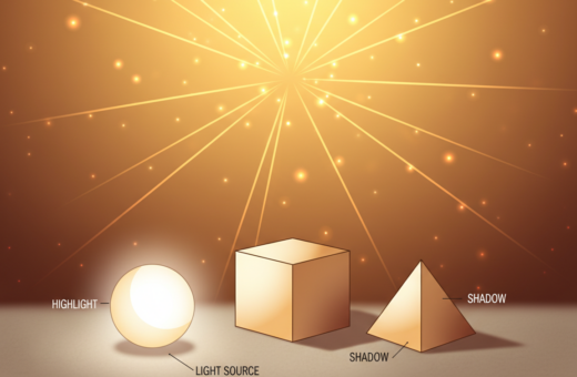
Key terms you need for light and shadow drawing basics
Knowing the vocabulary helps you see what to do with a pencil. Below are precise, usable definitions tied to simple mark-making. Keep values clear: where to stay clean, where to soften, and where to leave a bright note.
Highlight and halftones on the light side
Highlight: the brightest spot on the surface. Place it to show the source direction and the viewer’s angle. Preserve its brightness; avoid smudging it into mid-tones.
Halftones: turning tones that wrap the form. Use light, directional strokes to bridge from highlight to the terminator. Halftones must remain lighter than any value in the shadow side.
Terminator and the narrow transition
Terminator: the thin boundary where the surface stops receiving direct rays. Treat it as a controlled, narrow transition — not an outline. Soften edges only across a small area to keep form readable.
Form shadow, core shadow, and why the core is darkest
Form shadow: the whole darker side of the object. Block it in with consistent mid-to-dark values.
Core shadow: the darkest band near the terminator. It sits deepest because it receives the least reflected light. Strengthen the core to anchor volume, then blend outward gently.
Reflected light and when to keep it subtle
Reflected light: bounce from nearby surfaces. Use it sparingly; beginners often overstate it and flatten the core. Slightly lift values where bounce occurs, but keep the main shadow family intact.
Cast shadow, occlusion, and softening edges
Cast shadow: the shape a form projects onto a surface. Match its contour to the object and maintain consistent direction with the source.
Occlusion: the darkest, contact area where no light reaches. Emphasize occlusion to seat objects on their plane.
“Cast edges read sharp near contact and soften with distance; use that rule to sell realism.”
- Keep highlight placement as a clue to source and view.
- Let the terminator be a narrow transition, not a line.
- Make the core shadow the darkest part of the form shadow.
- Soften cast edges with distance; darken occlusion at contact points.
Map the big shapes before shading details
Map the biggest value zones first to keep your plan for form clear before any softening begins. Start by seeing the scene as two families: the lit family and the dark family. This high-contrast block-in sets the design and prevents mid-tone mush while you work.

Start with a sphere to learn transferable rules
A single sphere reveals every key part: highlight, halftone roll, terminator, core, reflected note, and the cast shadow. Practice by sketching a sphere under one lamp, then draw its cast shadow on the plane.
Notan-style block-in: separate lights from darks
Decide the light family and the dark family before any blending. Paint shapes with bold, flat values so the overall design reads at a glance. Keep the light side simple and the dark side grouped.
Predicting cast shadow shape from form and direction
Follow the source direction and project the object’s silhouette onto the ground plane. A sphere makes an elliptical cast shadow; a cube gives a more square shape. Outline both the on-form shadow and the cast shape, then refine edges.
- Draw the object silhouette.
- Project rays in the chosen direction to the ground.
- Block in the two value families, then adjust occlusion points.
| Object | On-form shadow | Typical cast shape |
|---|---|---|
| Sphere | Curved terminator, roll of halftone | Ellipse on flat plane |
| Cube | Flat planes, sharp plane breaks | Angular, near-rectangular |
| Cylinder | One curved, one flat plane | Rounded rectangle or elongated ellipse |
“Block-in first; details later.”
Build believable shading with mid-tones and controlled transitions
Ask where the surface turns away; that observation guides every mid-tone and edge you place.
Keep one rule central: the light family must remain lighter than the shadow family even after adding bounce. This value hierarchy keeps the form readable and prevents the darker areas from creeping into the lit side.
The mid-tone band is what creates round form. Add mid-tones gradually on the lit side to turn the surface while protecting the highlight from getting chalky. Use thin, layered passes rather than one heavy stroke.
Practical blending steps
- Block families: separate lights from darks first.
- Blend within families: light into halftone; shadow into shadow.
- Soften across the terminator last, keeping the transition narrow.
Render the terminator as a controlled, soft transition over a small area. Over-blending here flattens the form. Keep the core band darker to anchor volume and check occlusion at contact points for crispness.
Edges that sell realism
Make occlusion edges the sharpest near contact points. Let cast edges soften as they travel away from the away light source. This contrast in edge quality reads as depth.
“Small, deliberate layers give you control. Pressure matters: build value in thin passes, then refine.”
| Focus | Technique | Result |
|---|---|---|
| Value hierarchy | Keep light family lighter than shadow family | Clear volume, intact highlights |
| Mid-tones | Layer gradually on the lit side | Convincing round form |
| Terminator | Soft, narrow transition only | Form reads as turning |
| Edges | Crisp at occlusion, softer away from source | Realistic depth cues |
Quick checklist: keep highlights as anchors, preserve the core band, check occlusion at contact, and verify cast direction from the away light source before final blending.
Add reflected light and context without breaking your shadows
Reflected light acts as environmental feedback into the darker side of an object. Keep this return subtle so the core band stays the darkest. Use it to separate the form shadow from the cast shadow without flattening the volume.
How surface color and reflectivity change bounce
A white tabletop lifts nearby values; dark wood keeps tones low. Glossy surfaces return more color than matte ones, so the same scene will show different tint on the form shadow based on surrounding color.
Practical steps to keep shadow integrity
- Give the plane a background tone so the object does not float.
- Lightly raise the form shadow near the bounce side without exceeding lit values.
- Keep the cast shadow darker at contact, then allow it to soften outward.
“Reflected notes inform the dark side; they do not erase the core band.”
Try an experiment: hold colored paper near the subject and watch the tint shift in the shadow side. This exercise trains people to see how ambient light and surrounding color affect an image. Use restraint—this subtlety often makes work look advanced while keeping consistent lighting logic.
Common mistakes artists make with lights and darks
Beginners trip up most often when soft transitions erase the clear split between lit areas and darker planes.
Over-blending until the structure vanishes. Overworking halftones can collapse the notan design. Fix: stop while the two families still read. Restate edges with controlled strokes, then blend in thin layers.
Over-blending
What goes wrong: gradual smudging removes the terminator and flattens form.
Quick fix: block families first, then add only a few light passes to link highlight to mid-tone.
Dark-side creep
What goes wrong: the dark side spreads into the lit zone and steals contrast.
Quick fix: protect the terminator by reasserting halftones on the lit side. Use an eraser to lift stray dark marks if needed.
Overstating reflected light
What goes wrong: too-bright reflected notes remove the core, making forms look plastic.
Quick fix: keep returns subtle; raise values only a touch and keep the core band darker than nearby bounce.
Inconsistent cast shadows
What goes wrong: mismatched directions, shapes, or multiple highlights imply multiple sources and break realism.
Quick fix: trace a straight line from the deepest cast edge back to the chosen source. Verify all shadows follow that line. Simplify to one source until you can keep the hierarchy consistent.
“If the scene stops agreeing with its own sources, simplify the setup and map big shapes again.”
- Do a quick diagnostics: check cast direction, contrast between families, and the core band at contact points.
- When confused, return to a one-source setup and practice map → block → refine.
- These are common, fixable issues; process control beats force every time.
Conclusion
A steady single source makes outcomes repeatable and speeds learning.
Repeat this workflow: control one light source → learn the key terms → block in light vs shadow → add mid-tones → refine the terminator and edges → add subtle reflected notes. Keep each pass deliberate and stop before over-blending.
The one rule that fixes most pieces: keep the light family lighter than the shadow family. Protect that hierarchy and forms will read with minimal effort.
Practice plan: do a 15–30 minute sphere study daily for a week. Change only one variable each session (angle or distance). Use quick notan block-ins before details to protect the design.
Always check cast logic: the cast shape and direction must match the chosen source and the object’s silhouette. For a deeper primer on how this behaves, see how light and shadow work.
Master these parts and the methods will transfer across media — graphite, charcoal, digital, or paint — and across every subject you draw.