Anúncios
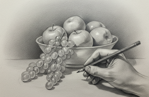
Create depth on a flat surface by arranging foreground, midground, and background elements with clear contrast. Small changes in value and edge treatment guide the viewer and make objects read at different distances.
Every artist benefits from a simple plan: place stronger contrast and sharper edges up front, soften colour and value as things recede, and use a clear horizon line with shadow areas to anchor each object. Bill Martin defines contrast as the relationship between light and dark values, which helps create illusion depth.
Whether you work with pencils or paint, controlling the light source and balancing linear and atmospheric perspective will create a convincing sense depth. Photographer Stacy Honda’s work, Connection, shows how focus and placement pull attention through the scene.
In short: arrange elements, manage light dark values, and layer colours thoughtfully to create sense depth that feels natural and intentional.
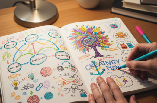
Understanding the Fundamentals of Depth Layers Drawing Technique
Breaking a composition into distinct visual zones makes space feel believable.
Anúncios
Organize your scene so the foreground, midground, and background guide the viewer. Place stronger contrast and clearer edges up front. Soften colour and value as objects recede to suggest distance.
Begin with pencils to map light and shadow values on the surface. Early values set the overall effect and help you place each object with confidence.
Use linear perspective as a simple guide to scale and placement. This keeps object proportions consistent and reinforces the illusion of space.
Anúncios
When painting, watch how colours shift and lose intensity as they move back. Clear edges in the foreground and softer transitions behind will steer attention.
Minisa Robinson, a 4th Edition Finalist, applied these principles in her wood burning piece “Train” to create a strong illusion depth that draws the viewer in.
- Plan zones
- Block in values early
- Refine edges for clarity
Mastering Size and Overlapping for Spatial Awareness
Scale and overlap act like a map, guiding the viewer through the space of your composition. Size ratios and the careful placement of objects on the surface are the simplest tools for creating depth and a believable sense of distance.
Size Ratios
Objects in the foreground should appear larger than those in the background to follow linear perspective. This visual rule helps the viewer instantly judge distance and scale.
Tip: Adjust object size to lead the eye across the piece so the background does not compete with the foreground. Small changes in scale change the whole effect.
The Power of Overlapping
When one object partially covers another, the brain orders elements into a clear hierarchy. Overlap creates a strong illusion that one object sits in front of another.
- Size ratios make closer items feel bigger and more important.
- Overlapping defines relationships and reinforces the sense of distance.
- Use pencils to mark edges and refine where objects meet for a realistic painting or sketch.
- Careful application of colours and a subtle layer of contrast will enhance the illusion and effect.
Remember: the spacing between objects and the way you place them on the surface determines how the viewer reads the scene. Thoughtful overlap and scale guide attention and create illusion depth that feels natural.
Utilizing Contrast and Value to Define Form
Controlling value relationships makes objects feel solid and believable to the viewer. Use contrast to separate foreground from background and to guide the eye through the scene.
Bill Martin reminds us that contrast is the relationship between light and dark values. Apply stronger contrast to foreground elements and reduce contrast as distance increases to maintain perspective and create illusion depth.
Managing Light and Shadow
The light source determines where shadows fall. Accurately place shadow areas to anchor each object on the surface.
- Use pencils to map a range of values before adding colour or paint.
- Remember Susan Jenkins: vertical elements, like trees, often read darker than flat surfaces.
- Manuel Dampeyroux shows how oil on wood can control glow and shadow for a convincing effect.
Manage edges between light and dark to shape form. Hard edges up front and softer edges toward the background help the viewer read spatial relationships. For help blending values and creating smooth transitions, see smooth tonal gradients.
Applying Atmospheric Perspective Through Color and Temperature
Tiny particles in the air quietly shift colour and soften forms over distance.
Atmospheric perspective explains why faraway objects lose colour and contrast. The more air between you and an object, the more particles scatter light and cool the colour. Use this to make a believable illusion of distance on a flat surface.
Color Intensity
Keep foreground objects warm and saturated. Let background tones become cooler and less vivid. This contrast helps the eye read which elements sit near the front and which recede.
Temperature Shifts
Warm light on a close object makes it pop. Cooler tones on distant objects push them back. Shift temperature subtly to build a convincing sense of perspective and illusion depth.
Atmospheric Particles
- Air particles reduce colour intensity as distance increases.
- Use pencils to vary pressure and control colour strength on your surface.
- Soften edges and lower contrast for distant objects to sell the effect.
Tip: Treat each layer of colour with intent so values and contrast work together to create a natural, believable scene.
Refining Edges and Focus for Realistic Depth
Edges and focus decide which objects grab the viewer and which fade away. Refining the edges of your subjects is crucial to create a convincing illusion of space.
Keep foreground objects in sharp focus with hard edges so they read as near. Soft, blurry edges belong to the background to mimic atmospheric perspective and the scattering of light.
When painting, switch brushes to get crisp edges up front and lost edges behind. Use pencils to mark exact edges and guide the viewer’s attention before you add colour or paint.
- Define an object’s edge with stronger contrast for form and position.
- Soften distant elements to suggest distance and atmospheric perspective.
- Manage your layers so edges match the intended distance of each object.
Balance sharp and soft edges to guide attention through the scene. Combining clear edges, controlled values, and subtle colour shifts gives your work a professional effect and a believable sense of depth.
Incorporating Foreshortening and Compositional Elements
Foreshortening forces objects into the viewer’s space, changing how we read their size and form. Use this to introduce drama and realism in both drawing and painting. Creativebloq defines foreshortening as a way to show an object moving away from the viewer on a flat surface.
Perspective and viewing angles control how much an object compresses toward the eye. Change the angle and parts of an object will look shorter. This shift helps sell a believable sense of distance and depth.
Practical steps
- Sketch with pencils first to check proportions and avoid distortion.
- Place a clear horizon line so all objects relate correctly to the light source and ground plane.
- Use light dark values and shadow to model volume and anchor foreshortened forms.
- Layer colours and apply atmospheric perspective so complex foreshortened objects sit naturally in the background.
Practice different viewpoints to learn how an object looks when it moves toward or away from the viewer. Combine linear perspective, contrast, and careful edges to keep your composition convincing and professional.
For more on how light shapes form, see light and shadow fundamentals.
Conclusion
Strong planning turns a flat surface into an image that feels alive and three‑dimensional.
Mastering depth drawing allows artists to transform simple marks into convincing space. By applying intentional layer placement, clear values, and defined edges, you can create a sense depth that reads as natural and professional.
Use linear perspective and strategic light to anchor forms, whether you are working in drawing or painting. Practice small studies, adjust scale, and test colour shifts to find what works for your style.
Try one idea at a time and record results. Please leave a comment below to share which method helped you most on your creative journey.