Anúncios
What you’ll learn: a practical, field-tested guide to on-location drawing that helps you capture clear, expressive outdoor scenes fast.
This introduction sets expectations for a step-by-step progression: define the practice, choose a compact kit, pick a spot, and work composition, perspective, value, and color. The guide covers both ink-only and ink + watercolor approaches, plus travel-friendly markers and digital alternatives.
The outdoors brings challenges: changing light, moving people, and limited time. A simple field kit and a short planning routine prevent decision fatigue and keep you sketching instead of wandering.
Fast readability is the goal. Strong composition, clear linework, and bold value contrast let a sketch read from a distance. Focus on repeatable systems rather than swapping supplies.
Keep it low pressure: aim for steady progress in observation and technique, not perfect realism. Small, repeatable practices lead to big improvement.
Anúncios
What Urban Sketching Is and Why Outdoor Scenes Are Different
On-location drawing is about seeing and recording scenes as they unfold, not recreating them from photos.
urban sketching means working from direct observation. You draw what you see, on the spot, whether inside a cafe or out on a street. That choice forces fast decisions about composition and detail.
Outdoor scenes feel harder because light moves, weather changes, and people travel through the frame. You often have only a short window before the view shifts. Those limits teach you to simplify and prioritize.
Anúncios
The practice also creates a record of time and place. A quick sketch becomes a tiny document of your route, the weather, and what was happening at that moment. It’s visual reporting.
Community and the storytelling mindset
The Urban Sketchers movement—founded by Gabriel Campanario—encourages this approach. Chapters meet for sketchcrawls around world, offering support if you feel shy drawing in public.
Truthful here does not mean photographic. It means honest observation with room for stylization and selective detail. Once you accept story + place, choices about composition, value, and color get much clearer.
Build a Minimal, Portable Sketch Kit You’ll Actually Carry
Keep it simple to avoid decision fatigue. Too many tools slow you down when light or action changes. A small set helps you focus on seeing, not choosing.
Starter tools
- Pencil for quick blocking and corrections.
- Two fineliners (0.2, 0.7) for varied line weight—use the 0.2 for detail and 0.7 for structure.
- Compact sketchbook: a 3.5×5.5 Stillman & Birn Alpha handles light watercolour well.
- Optional small watercolour set and two brushes (small/large) or a water brush for easy washes.
Alternative media
When watercolour isn’t practical, carry a pair of gray/black markers for fast value, or a limited marker set for color. Colored pencils, gouache, or digital (iPad/Procreate) also work for travel.
| Kit Type | Contents | Best Use |
|---|---|---|
| Grab-and-go | Pencil, 2 pens, small sketchbook | Daily practice, quick scenes |
| Watercolour field | Watercolour set, water brush, 2 brushes, watercolor paper sketchbook | Color studies, value washes |
| Micro-kit | Pocket sketchbook + one pen | Commuter sketches, people practice |
For a deeper how-to on packing, see this portable art kit.
Choose the Right Location and Set Up for Success Outdoors
Picking the right spot before you open your sketchbook saves time and makes each session more productive. A quick plan prevents wandering and protects your allotted time for practice.
Pick clear subjects fast
Scan for a single subject that reads at a glance: a café corner, a distinctive doorway, or a bench under a tree.
Clear subjects help the viewer know where to look first and make storytelling easier.
Look for a strong sense of place
Choose scenes with signage, local architecture, street furniture, or a transit element that reveals location.
Those cues give context quickly and make a sketch feel like a real day in that place.
Quick setup and time-boxing
- Sit or stand where you can see the subject without moving much.
- Stabilize your sketchbook and decide framing before the first line.
- Set a time box (20, 45, or 90 minutes) to match your schedule and reduce pressure.
Stay focused and comfortable
Pick one area, commit to one page, then explore after you finish. This anti-wandering plan protects practice time.
Comfort and safety—shade, wind shelter, low foot traffic—improve line quality and observation.
Act like a sketcher in the field: observe, select, and document rather than trying to capture everything.
urban sketching tips for Composition That Reads Fast
Before you lay in a full drawing, make 2–4 thumbnail sketches. These tiny frames test angle, crop, and where the eye should land. They save time and stop you from committing to a weak layout.
Use quick thumbnails to decide framing
Keep mini frames simple: mark the focal area, a horizon, and a main shape. Note light or shadow blocks and try a tighter crop if background noise competes.
Build depth with three layers
Create a foreground anchor, a midground subject, and a calm background mass. Use heavier line weight and darker value up front, then simplify forms and reduce contrast behind to suggest depth.
Overlap and simplify for clarity
Let objects overlap—people in front of benches or a lamppost in front of a building—to build space. Cut repetitive details and skip textures that distract.
- Emphasize what matters: sharpen edges or darken values where you want focus.
- Quiet areas should lose contrast to keep the page readable from a distance.
Perspective and Linework Techniques for Streets, Buildings, and Parks
Use simple perspective anchors and confident ink to map the street before you add detail. Start broad, mark the main vanishing directions, then commit. This keeps proportions honest and saves time when things change.
Perspective cues that add realism
Watch for converging edges—street curbs, rooflines, and rows of posts point toward vanishing zones. Keep verticals consistent; they ground buildings and trees.
Repeat elements shrink as they recede. Mark a few reference heights for windows or lampposts to keep scale believable.
Line weight to separate planes
Use heavier ink for foreground edges and shadow sides. Use thinner lines for distant forms and interior detail.
This simple contrast creates instant depth and clarifies which objects read first.
When to suggest instead of outlining
Hint window groups with a few strokes rather than drawing every pane. Let large shapes carry the composition and reserve texture for focal areas.
Confident, decisive lines often read better than slow, tentative ones. If a line wobbles, make it purposeful—intentional marks become part of your style.
- Lightly place main perspective directions first.
- Commit to ink once angles feel right.
- Prioritize big shapes over small details to protect limited outdoor time.
Light, Shadow, and Contrast to Make Outdoor Sketches Pop
A confident value plan is the fastest way to make a plein-air sketch feel alive.
Start by finding the light direction and mark the largest shadow shapes first. This locks the scene’s structure and keeps your page readable when light shifts.

Finding your darkest darks and lightest lights for impact
Reserve deepest values for focal areas: under awnings, doorways, and beneath benches or cars. These darks anchor a composition and create immediate impact.
Shadows, highlights, and leaving the white of the page
Leave white paper for highlights rather than trying to paint them in later. In watercolour and line-and-wash work, untouched paper reads brighter than added pigment.
Contrast tricks: textures vs. quiet areas, line vs. filled shapes
Use texture in one area and calm elsewhere. For example, textured brick next to a smooth sky grabs attention.
- Simplify the shadow map: fewer, larger shadow shapes read better than many small ones.
- Use heavier line weight and darker fills up front; soften edges and values behind to create depth.
- Adopt a fast value system: white paper, a mid gray wash or marker, and a dark ink for darkest darks.
| Step | What to mark | Why it helps |
|---|---|---|
| 1. Identify light | Primary light direction and cast shadows | Gives consistent highlights and shadow placement |
| 2. Block largest shadows | Main shadow masses (awnings, trees, undercars) | Anchors composition and saves time |
| 3. Add accents | Deepest darks, thin lines, and quiet zones | Creates focal contrast and perceived depth |
Add Color Without Mud: Watercolor Layers and Limited Palettes
Adding color outdoors is about restraint: a few planned layers keep washes bright and avoid muddy mixes.
Why layering matters
Watercolour dries lighter than it looks when wet, so a single thin wash often reads flat. Build depth with glazing rather than overworking a spot.
- Sequence: light wash for large planes; second pass to deepen shadow sides; final accents for focal pops and cast shadows.
- Use gray marker or quick markers under a wash to lock value when time is short.
- Practice mixing charts at home so outdoor decisions stay fast and confident.
Palettes that avoid mud
Pick 3–5 colours that mix cleanly: a warm neutral for buildings, a cool sky color, one foliage green, and one saturated accent for signage or clothing.
Monochrome and accent strategies
A monochrome study (one pigment in several values) looks editorial and pairs well with bold ink. Or keep most tones neutral and add one bright colour to guide the eye.
Practice these techniques in short sessions to make color decisions automatic in the field.
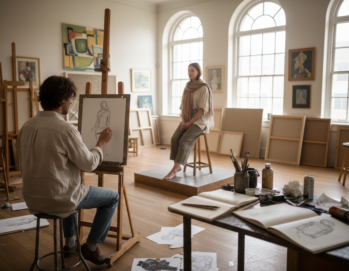
Sketching People Outdoors to Bring Your Scene to Life
People add life to a scene; learning to draw them quickly makes any outdoor page sing.
Good places to find steady subjects include park benches, café seating, market lines, transit platforms, and food courts. Commuters on phones, readers, and people waiting in line are easier to draw because they stay put longer.
Fast methods for moving subjects
Start with the head and torso angle, then place legs and feet. Connect those with simple shapes before adding detail. Use a pen and small sketchbook so you can work without hesitation.
Low-pressure ways to practice in public
- Sketch with a friend or sit slightly to the side.
- Begin with tiny background figures, then try closer subjects.
- If noticed, show the page, say you’re learning, and move on if they seem uneasy.
Action-first figures and avoiding stiffness
Draw what people are doing—walking, eating, typing, or leaning—to suggest motion. Shift weight to one leg and vary arm angles to avoid stiff, symmetrical poses.
| Drill | How | Why it helps |
|---|---|---|
| 60–90 sec sketches | One-minute gestures in pen | Train posture recognition and speed |
| Seat-and-watch | Draw people who just sat down | Longer pose time for detail |
| Background figures | Tiny shapes with light marks | Build scene rhythm without pressure |
Recommended books to study figure basics include “Keys to Drawing” by Bert Dodson and short guides by Lynne Chapman and Gabriel Campanario. Consider a short course if you want structured sketching skills practice.
Tell a Stronger Story With Notes, Details, and Intentional Constraints
Turn small observations into a clear narrative to make your pages feel lived-in. Add brief written notes—weather, a overheard line, or the time—to anchor memory and context.
Use sequencing to show change: two or three small sketches on one page can record arrival → action → departure. Simple captions, arrows, and speech bubbles make a sequence readable at a glance.
Storytelling devices
- Speech bubbles, brief captions, and timestamps give voice and pace.
- Small icon details—tickets, signs, or a quick map—add evidence of place.
- Overlap figures and show motion to imply events across time.
Use constraints to grow your style
Limit tools or colors for a session: pen-only, a 3-color palette, or people-only studies. Constraints cut choices, force repetition, and help a personal style emerge faster.
Sketchbook spread layouts
Try a hero sketch plus three vignettes, a grid of quick studies, or a walk map with notes. Treat the book as a visual report that shows your way of seeing the world.
| Layout | What to include | Best use |
|---|---|---|
| Hero + Vignettes | Main scene, 3 small moments, 1 caption | Document a single place or event |
| Grid Studies | 6–9 tiny sketches, timestamps | Practice variety and pacing |
| Map Page | Route sketch, notes, ticket stub | Record a walk or travel day around world |
Want structure? A short course or books can sharpen these methods. Over years of practice, these devices turn isolated drawings into reports that show the world your way.
Conclusion
A quick field checklist ties all the methods here into a usable session plan.
Choose a clear location, make 2–4 thumbnails, block perspective, and commit to clean ink linework. Then map the main light and shadow, add restrained colour, and place selective details.
Carry a simple kit and sketch short sessions often; even a 10‑minute page builds skill and memory. Be flexible: light and people move, so favor the story and overall read over perfect accuracy.
Add a few simplified people to show scale and narrative. Keep contrast and a clear value plan as your reliable pop, whether you work ink‑only or with washes.
Next steps: try a week of constraints (pen‑only or three colours) and make a sequence spread. Sketchers communities can speed learning, but the book you fill is your best record of time and place.