Anúncios
Mastering form and visual tension helps artists tell a story at a glance. This introduction shows how simple choices in form, silhouette, and color guide the viewer to read a figure’s traits fast. It is the present art practice for many animation teams and indie creators alike.
In this article we examine practical techniques that turn basic forms into memorable icons. You will see an example case that uses squares and circles to cue role and mood. The rule of visual hierarchy keeps a lot of content clear so the eye lands on key details like the body or the face.
By studying how professionals use these methods, you can refine your own work and create stronger impressions. Expect clear steps and visuals that make the meaning of each choice easy to use in your next animation or art project.
Understanding the Psychology of Shape Language
Simple geometric cues steer how viewers feel about a character before a single line of dialogue.
Solomon Asch showed in 1946 that basic form and physical traits change the emotional impression a figure gives. That study still underpins modern practice in visual language.
Anúncios
Emmy winner David Colman adds that the body and overall posture often carry more emotional weight than a single facial expression. The way a figure stands or moves sets the mood fast.
- Simple forms influence the audience’s feeling without heavy color cues or dialogue.
- The “Anger” figure in Inside‑Out uses a rectangular silhouette to reinforce a short‑tempered personality.
- Focus on eyes, body, and posture to give consistent meaning across poses and facial expression.
In practice, learning this visual language helps you craft characters that read clearly. Use basic geometry and posture in your next article on visual development to build instant personality and lasting impression.
Core Geometric Shapes in Character Design
Core forms act like visual shortcuts, letting viewers read personality in a single glance. Use simple elements to set tone quickly. Each major form gives a different emotional cue that helps the audience understand the role and mood.
Anúncios
Circles for Friendliness
Circles read as soft and approachable. Rounded heads and bodies make characters feel safe and warm.
Use circles for friendly roles, playful expressions, and softer faces.
Squares for Stability
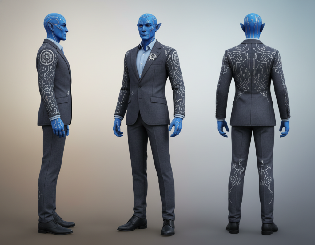
Squares suggest steadiness and stubbornness. A well-known example is Carl from the 2009 Pixar film Up, whose square-like forms support his stubborn personality.
Squares work well when you want a figure to feel grounded and reliable.
Triangles for Dynamism
Triangles add energy and threat. Charles Muntz in Up uses angular triangles in his head, shoes, and cane to read as more aggressive.
Mixing these three simple elements in practice helps artists build nuanced character designs. Add small details to the face or body to refine personality without losing a clear silhouette.
- Try focusing on one shape at a time to learn its effect.
- Mix shapes to create more complex and interesting figures for animation or art work.
Mastering Shape Contrast Character Design for Personality
Juxtaposing two forms makes their roles and moods obvious in seconds. Use clear silhouettes to guide the viewer and give each person a readable personality. When you pair a rounded figure with a sharper one, the audience reads their intentions fast.
Look at the 2009 game Uncharted 2. Naughty Dog used the “what is beautiful is good” idea to set the hero against the villain. That case shows how a visual rule helps storytelling in animation and interactive work.
Randy Bishop teaches how using a triangle or circle motif changes a role immediately. Try placing squares next to triangles to make a dependable figure look steady and a triangle-driven figure feel more dangerous.
- Practice until silhouettes read at a glance.
- Place two characters side by side to amplify differences for the audience.
- Small silhouette tweaks create a lot more depth over time.
Mastery comes from repeated study and iteration. Over time, these tiny shifts in form and posture shape stronger, more believable characters for your article, animation, or portfolio.
Applying Silhouette and Body Language Principles
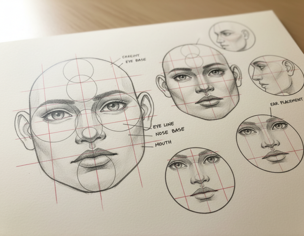
A clear outline and posture make a personality legible at a glance. Use silhouette and body language to lock in a figure’s intent and mood before details are added.
Capturing Masculine and Feminine Forms
Artists often use a convex profile for male figures and a soft, concave flow for female figures to cue viewers quickly. These choices influence how the face and body read together.
For example, a broad chest and steady hips suggest strength. A tapered waist and curved shoulders can read as graceful. Add subtle motifs like triangles in clothing for edge or circles for warmth to support the impression.
The Role of Posing
Posing gives life to the silhouette. A tilted head or a stretched arm changes intent instantly.
- Make the eyes and facial expression the emotional anchor so personality stays consistent across poses.
- Push limbs and torso to create readable lines that match the figure’s nature.
- Think like nature: organic balance makes the form feel believable and memorable.
In practice, test poses in thumbnail form until each stance tells the same story as the face. That way every movement strengthens the overall personality and makes the figures easier to read in motion or still images.
Advanced Techniques for Visual Hierarchy and Contrast
A smart use of light and dark tells the audience where to look first.
Using value rather than loud color choices helps artists guide attention with subtlety. Yuichiro Fujita, a 3D artist, stresses that tonal differences direct the viewer’s eyes more reliably than saturation or hue.
Using Value Contrast to Guide the Viewer
Start with a focal plan: place stronger value contrast in the body or clothing to lead the eye, then soften the tone on the face to add mystery or depth.
“Value contrast is the most effective way to guide the viewer’s eyes toward the most important parts of a character.”
- Combine study and sculpting practice to test how values read in three dimensions — a lesson from Hiroshi Katagiri’s workshops.
- Use clear silhouettes, a lesson many artists learn from Akira Toriyama, to make personality legible even at small scales.
- Reduce face contrast when you want the audience to search for meaning; increase it when the face must read as the main focus.
In practice, these techniques let you control what the audience notices first and what supports the narrative. For a practical primer on construction methods that strengthen silhouette and form, see this fundamental construction guide.
Conclusion
Mastery grows from small, repeated studies of how forms interact and guide the eye.
Practice over time turns basic lessons in shape and value into lasting intuition. Use these simple rules to make a single figure read clearly in any frame or animation.
Focus on silhouette, balance, and visual language when you sketch. These choices help a character show personality fast and keep your content memorable.
Keep testing forms, refine your rule set, and share work often. With steady practice, your character design will feel alive and connect with viewers.